Logos
Erftbaskets
The Erftbaskets - a local sports team where in need of a new logo. They wanted something more "american", something fresh for the next season to start off with more power. That's what I made of it.
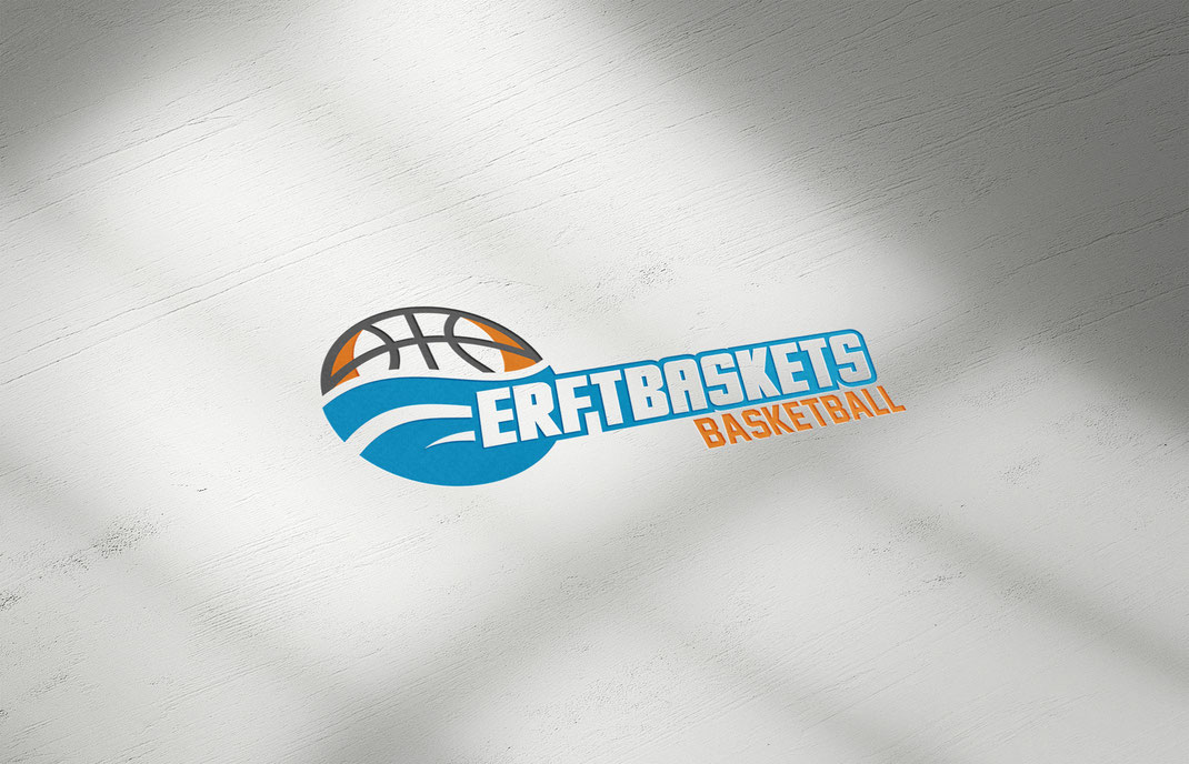
Final presentation form to simulate a gym floor.
To give you a better impression I'll show you the old logo vs the new one.
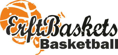
Before
The old logo was almost impossible to print on they sports wear. Also it's very chaotic and doesn't reflect their team properly.

After
The new logo reflects not only the team but also the name origin. The Erft is a small river running through the teams city. I incorporated the ball with the water flow. It's also no problem anymore to print the logo on their sports clothing.
I really wanted to create something that reflects the name and the hometown of the team so I started out by developing different kind of waves. At the end I had 5 different styles that I could show the client. They choose the waves that fit the form of the ball the best.


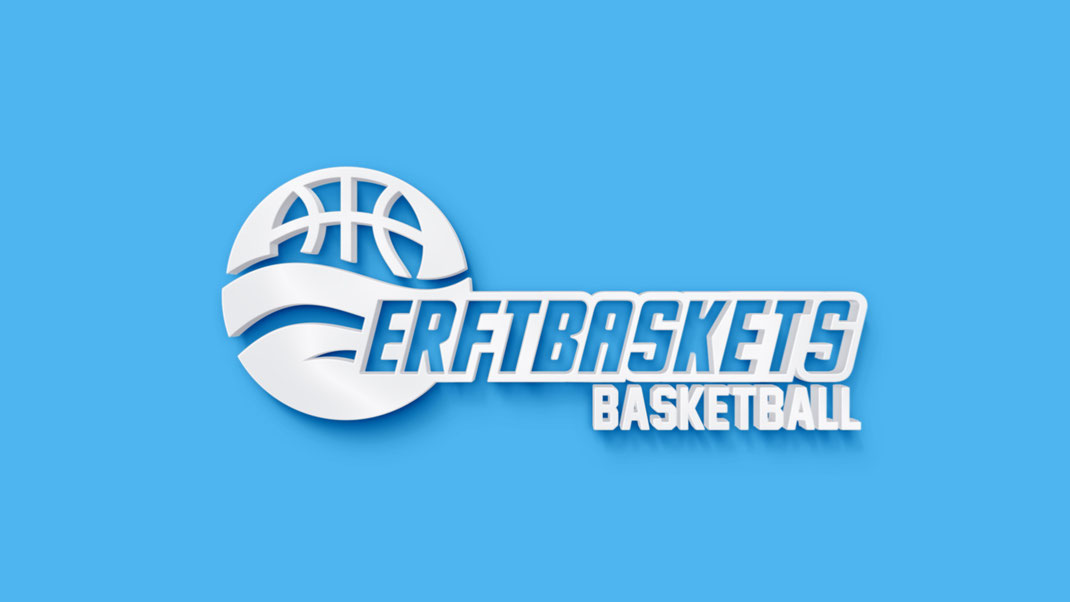
Another presentation form to show the "american touch".
Kolvenbach Florist
Kolvenbach is a big florist and gardening store. They wanted a new logo because they simply felt it was out of style. But because they've been in business with it for so long it should not be completely new but just more modern. Here is my solution:

Final presentation form on letter.
To give you a better impression I'll show you the old logo vs the new one.

Before
The old logo didn't showed everything they wanted to transmit with it. It's not modern, not fresh and very cornered.

After
By choosing an open and playful font and combine it with a curvy flower I tried to make the appearance a bit lighter, smoother and more feminine. I kept the colors and the flowerhead to not alienate it to much form the original.

Another presentation form for new more elegant business cards.
Yip M.A.N.
Yip M.A.N. is a martial arts academy. They wanted a new logo to go with a clothing line. And to match it with the modern clothes they needed a modern logo. So here is what I did for them:
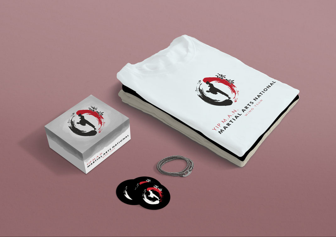
To give you a better impression I'll show you the old logo vs the new one.

Before
The old logo of the martial arts academy didn't really reflect their spirit. It's not free and open but conservative and a little out of style.

After
The new logo combines modern fonts with asian symbolic. The colors fit to the culture and reflect loyalty. It's powerful without being to loud. Just as the client wanted it to be.
W. Holz Transports
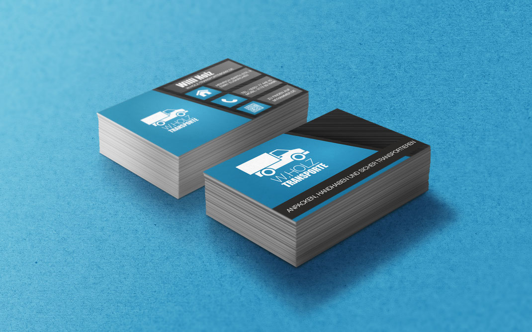
Final presentation form.

You can do it, too! Sign up for free now at https://www.jimdo.com
